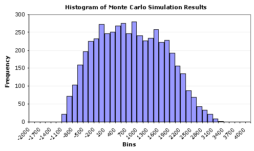
This graph you are looking at may look as if it were a typical bar graph. Well what this is, is a Histogram. What a histogram much like this one is to explain is a frequency but displayed in bars like this one. You can see this one is showing information from Monte Carlo and simulation results. On the left you can see the frequency from 0-300 by 50. Easy way to compare and look at data frequency results.
No comments:
Post a Comment