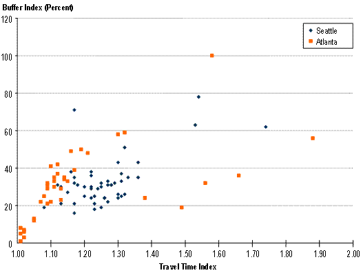
In a scatter plot as you see in this one there is a cluster of dots and of different color. What these graphs will tell you is a group of data and will show you where the majority of the data tends to cluster, almost showing you the average without even calculating. In this scatter blot if you look at the x and y axis you can see that this graph is giving you travel times and perentages.
Showing posts with label http://ops.fhwa.dot.gov/congestion_report/chapter3.htm. Show all posts
Thursday, July 29, 2010
Scatterplot
In a scatter plot as you see in this one there is a cluster of dots and of different color. What these graphs will tell you is a group of data and will show you where the majority of the data tends to cluster, almost showing you the average without even calculating. In this scatter blot if you look at the x and y axis you can see that this graph is giving you travel times and perentages.
Subscribe to:
Posts (Atom)